
As the saying goes – you can lead a horse to water, but if your landing page doesn’t tell them exactly what’s on offer, then you’ll lose the conversion.
Landing pages are a crucial part of your PPC strategy and if done correctly, can reap many rewards.
Keep reading as we discuss our top landing page tips to maximise conversions in your PPC campaigns.
- What is the purpose of a landing page?
- Why are landing pages important?
- Top landing page optimisation tips
- Final word
What is the purpose of a landing page?
In PPC, a landing page is where customers arrive after clicking an ad. Its purpose is to provide customers with enough information to convince them of the value of your product or service, and trust your business enough to convert on the page - whether a payment, registration, or form completion.
Landing pages often stand apart from the rest of a website and aren’t indexed – meaning it can’t be found in search engine results pages.
They are typically focused on one conversion, and they aim to reduce distraction by having limited navigation to the rest of your website so that visitors are more likely to convert.
Other benefits include:
- They are testable – therefore providing insights into audience behaviour
- They are targeted to your audience & campaigns
- They have the sole purpose of driving conversions (therefore increasing chances of conversions)
Why are landing pages important?
Landing pages tell your customers exactly why they should choose your business to solve their problems, and an optimised page can reap many rewards, including maximising conversions and ROI by focusing on specific goals.
Take one of our recent landing page projects for a PPC client: by creating targeted, optimised landing pages for a search campaign, we reduced their CPA by 75% and increased conversions by 200%.
Read more about our client work here.
Top landing page optimisation tips
1. Information first then design
It’s easy to get caught up in how the page will look before communicating the essentials of your product or service, but doing so risks missing key points out – and often results in frustrating design edits to fit in what was missed.
Instead, prioritise building your page around the copy you want to include rather than the design – this will ensure you cover everything that is necessary for a conversion to take place.
2. Keep the landing page relevant to the keywords you’re bidding on
This sounds obvious, but you’d be surprised how often landing pages in a PPC campaign don’t even mention the keywords being bid on. Imagine the buyer journey from clicking on the ad to landing on the page – and what you as a customer would expect to see.
Making sure the landing page continues seamlessly from the ads will help to keep your customers.
3. Include trust signals
Trust signals reassure customers that what you’re offering is legitimate and encourages conversions.
Trust signals can include:
- Case studies
- Logos of businesses you have already worked with
- Success rates
- Positive reviews
- Quotes
- Number of customers who have already used your product/service, downloaded your content or signed up to your newsletter
Try to include a few of these on your landing page to inspire confidence in your brand.
4. Adopt the reciprocity theory
Cialdini states that you have to give something to get something in return. Try including a special offer to customers who land on your page.
This could be a discount, a free trial, a free piece of content.
5. Keep CTAs consistent
Avoid using disparate call to actions (CTAs) which ask customers to do different things. A landing page should focus on one type of conversion – and this should be consistent throughout the page.
Likewise, don’t name the same call to action different things – this causes confusion and suggests discord to your visitors.
6. Include enough CTAs (and make sure they all work)
We often see clients who use CTAs too sparingly – and this can have a negative impact on conversions. Make sure there are enough to capture your audience’s attention and help them on their way.
If your page contains a lot of information – spread out text by interspersing CTAs in between to remind them of how they can access your product or services.
In addition, it’s not uncommon for landing page CTA buttons to not work. This is one way to ensure your customers don’t convert – so make sure to test your buttons!
7. Ensure target keywords are mentioned early on
Avoid keyword stuffing, but make sure your user can identify the keyword as soon as they arrive on the page to ensure their interest is peaked and reassure them that what they are looking at is relevant to their search.
8. Be clear what you’re offering
In marketing there’s often an emphasis on communicating the ‘why’ of your service over the ‘what’ and ‘how’ – and in many cases this can be an effective strategy – but with customers only spending 15 seconds on average deducing what a webpage is about before leaving, you don’t have much time to convince them you’ve got what they’re looking for.
When collating the information to be included on the landing page – don’t forget to include the vital details of WHAT is being offered, HOW customers can access it and any other terms that are essential for a customer to convert.
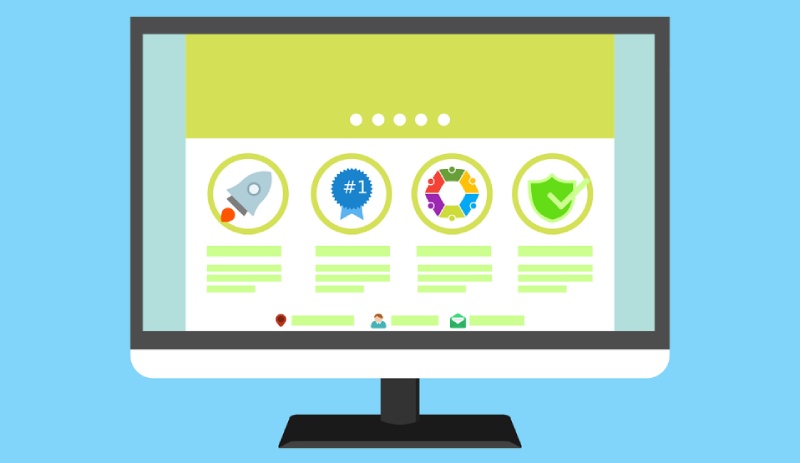
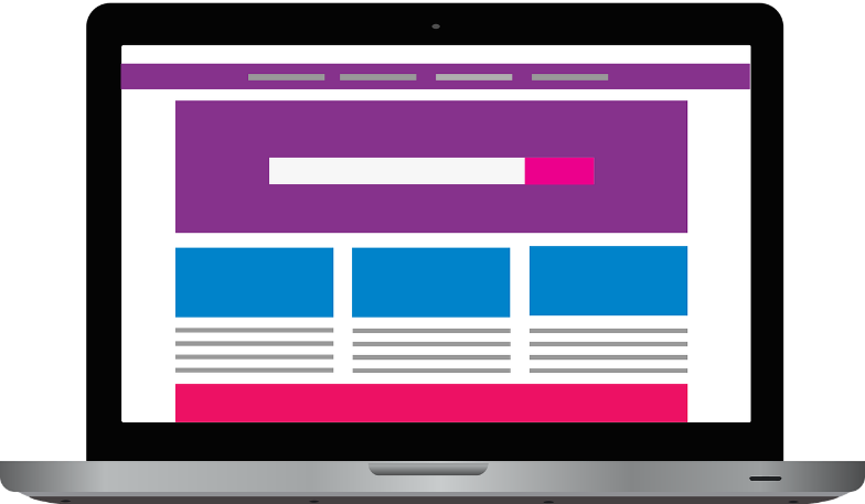
Here’s a good example of clearly communicating what is on offer and how customers can access it (with a great trust signal too!):
9. Use jargon sparingly
The purpose of your product or service can appear obvious to those who work with it every day, but to your customers less so. This is particularly true for SaaS businesses where buzzwords are common.
Customers usually know what their problem is, but not the solution to it. As a result, we recommend using jargon sparingly and approaching your copy from the problem and not the solution.
If it’s not possible to totally avoid jargon, include brief explanations for clarification.
It can also help to think of writing copy with a relative in mind who has no knowledge of your industry.
10. Be concise
A well explained landing page doesn’t have to mean long, drawling paragraphs. Good copy is the art of communicating as much as you can in as few words as possible.
Examples of concise pages include:
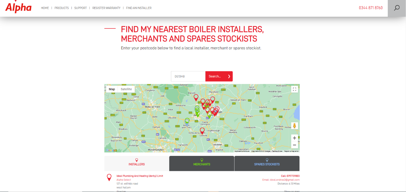
This Alpha landing page gets straight to the point and tells users exactly how to use their service - Enter your details to find a boiler installer. Simple!
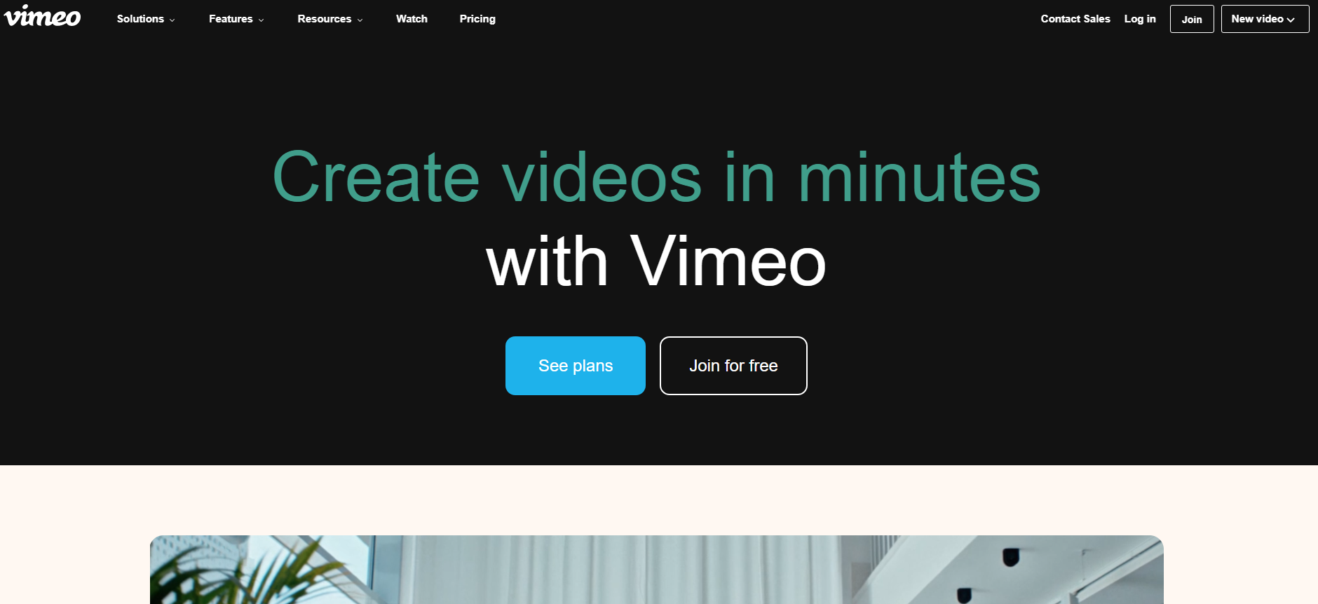
This Vimeo landing page cuts to the chase – telling you exactly what you can do with their service and how it benefits users (save time, create videos quickly) – in just 6 words.
11. Consider User Experience (UX)
UX is the process of providing meaningful online experiences to users and is essential to the landing page creation process.
There are a few core UX principles which can help guide your landing page design process:
- Relevance - Ensuring the most relevant parts of your page come first
- Usability – Ensuring the conversion process is as smooth as possible for the user
- Navigation – In the case of landing pages, keeping navigation as simple as possible helps customers focus on what’s important
- Accessibility – Making sure your page is as easy to read as possible. This includes sufficient contrast between text and background, subheadings to break up text, appropriately sized text, alt descriptions of images etc.
- Familiarity – Ensuring your page works consistently with the rest of the web – for example red to highlight errors or missing information in a form, a logo click taking you back to the homepage.
In addition to this, keeping in mind visual UX design and psychology tricks are also useful, for example:
- Having sufficient space between form boxes to make the form appear less complex to users
- Having no more than 3 different sizes of font to keep the page clean
- Ensuring spacing between subheadings, images, and other assets are equal to establish balance
- Establishing visual hierarchy by the ordering of different elements, using different scales, colours or placement
- Using colour scales to reduce the importance of certain text – e.g. greyed text for T&Cs
12. A/B and multivariate testing
Incorporating A/B testing into your campaign can provide valuable insights into how visitors are engaging with your landing pages and which elements work best.
A/B testing works by comparing two slightly different landing pages with the aim of identifying which variable works best for the campaign by increasing the number of conversions. Testing can be carried out through Google Ads’ custom experiments.
Variables could include the layout of headers and text, the offer (e.g. free trial vs 20% off), CTAs, product descriptions, images and other assets.
A/B testing differs from multivariate testing – which compares more variables of a page. Multivariate testing is another useful method of testing - ideal if you have many variables that you want to test – such as a whole design change.
13. Use tools such as HotJar for added insights
Making use of free tools such as HotJar can improve UX and provide valuable insights into how users interact with your landing page.
Hotjar provides heatmaps and behaviour analytics to quickly identify areas on your page where customers are engaging or struggling.
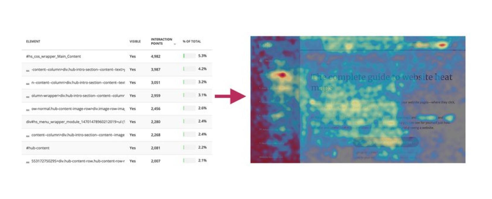 [Hotjar heatmap example]
14. Think about user intent
Identifying user intent can help to prioritise which pieces of information to show visitors first on your landing page. We recommend assessing the keywords you’re bidding on for your campaign with the aim of understanding the intent behind them.
If transactional, then key information to include first would include pricing, subscription terms (6 months, 12 months), what offers you have (free trials, free shipping, discounts).
If informational, then they may respond well to details on how the product or service will help them, what features are available, how to use it, informational video content, downloadable content such as brochures.
If commercial, then users are looking to educate themselves with the aim of buying. Trust signals may work well here – with proof that your company has a good track record of delivering, how your product or service compares to competitors, what makes your offering stand out.
15. Ensure page speed is optimised
There’s no better way to ensure a customer doesn’t make it to your landing page than having a slow page loading speed.
Landing pages need to load quickly and effortlessly.
This means having a robust hosting solution, compressed images (avoid overly large image files), deactivating unused plugins, and caching your page.
16. Nail your landing page headline & subheading
This is your opportunity to capture your visitors’ attention and convince them that they are in the right place.
The headline should be concise (no more than 20 words) and highlight exactly what is on offer.
We recommend emphasising how your product or service will benefit your customers – leading with verbs (capture, create, achieve etc) to instantly communicate the way your brand will serve your customers.
Similarly, the subline clarifies additional points that can’t be covered in the short and sweet headline. These are the most important features, additional points that will solve your customers’ problems, or key trust signals.
If you have an accompanying image, you can go sparingly on descriptive sublines – and instead focus on the ‘why’.
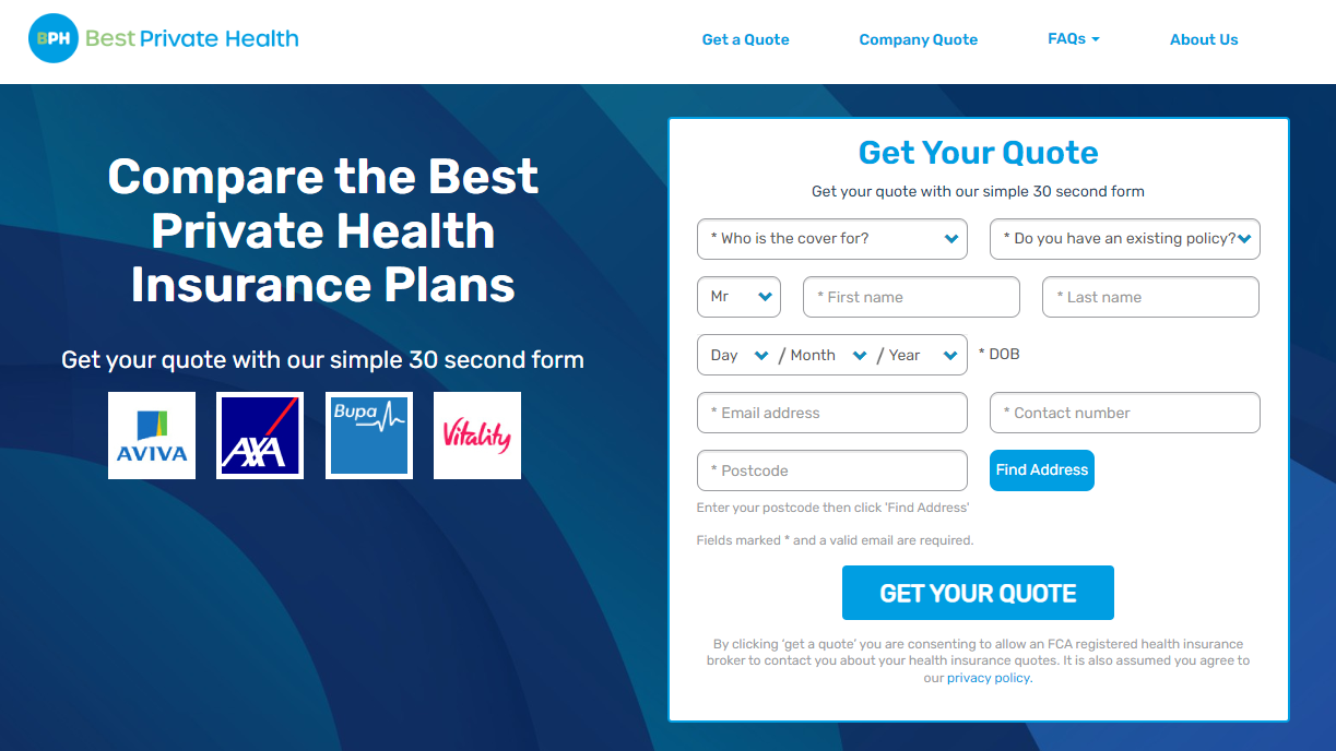
This health insurance comparison site concisely conveys what they offer to customers in the headline and communicates the benefits in just a few words (quick and easy, best private plans, trust signals with well known brand logos).
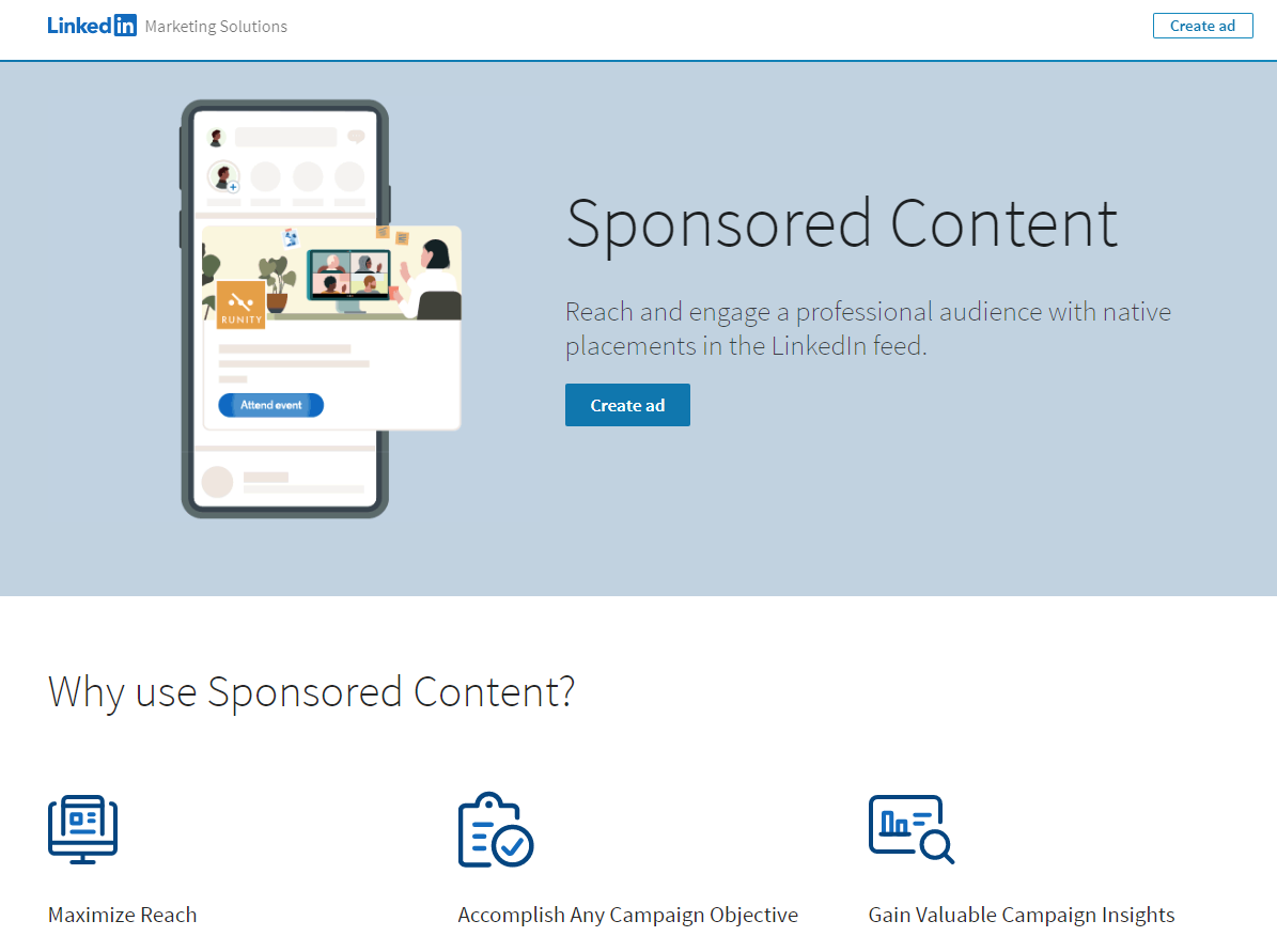
This LinkedIn landing page shows what customers will get from their sponsored content services in words and images, then goes on to succinctly communicate the ‘why’ of their service.
17. Choose the correct length landing page
The length of your landing page will depend on the level of commitment you are expecting of your visitors.
A larger commitment – such as parting with money or signing up for a subscription – will require a higher level of information and trust before a customer parts with their cash or details. If a larger commitment, it’s important to include all the features, benefits and details that a customer would need to evaluate the value against the expense.
The opposite is true for smaller commitments such as signing up to a newsletter, filling out a contact form or downloading content. In this case, avoid overwhelming your reader with surplus information and adopt the ‘less is more’ mantra.
Evaluate the size of commitment and adjust the length of your page accordingly.
18. Use SEO techniques
We recommend using SEO techniques to optimise your landing pages further to improve ROI. Whether they are indexed or not:
- Make sure that metadata is optimised
- Include keywords early on in the text
- Let your keywords guide the content
- Answer related popular questions in the content
- Add alt text to images
- Monitor page speed
Find out more about making your PPC campaigns work for SEO and vice versa here.
19. Don’t make users scroll to get to the important stuff
In the design process, make sure that the key information is before ‘the fold’. This means including all the key information before that spot where users have to scroll to see more.
20. ‘Thank you’ page for added value
A simple ‘thank you’ page can not only go a long way in enhancing customer experience, but it can also be a great opportunity to boost other conversions. For example – asking for referrals, linking to your social pages, or cross selling other products from your business is an excellent way to add value to your campaigns after securing that initial conversion.
‘Thank you’ pages are also an excellent way to make tracking conversions on your page easier – requiring a simple destination goal in Google Analytics, rather than adding code to forms.
Final word
If you need help creating high-performance PPC landing pages for increased conversions and ROI, or simply want advice on where you can improve, contact us today.